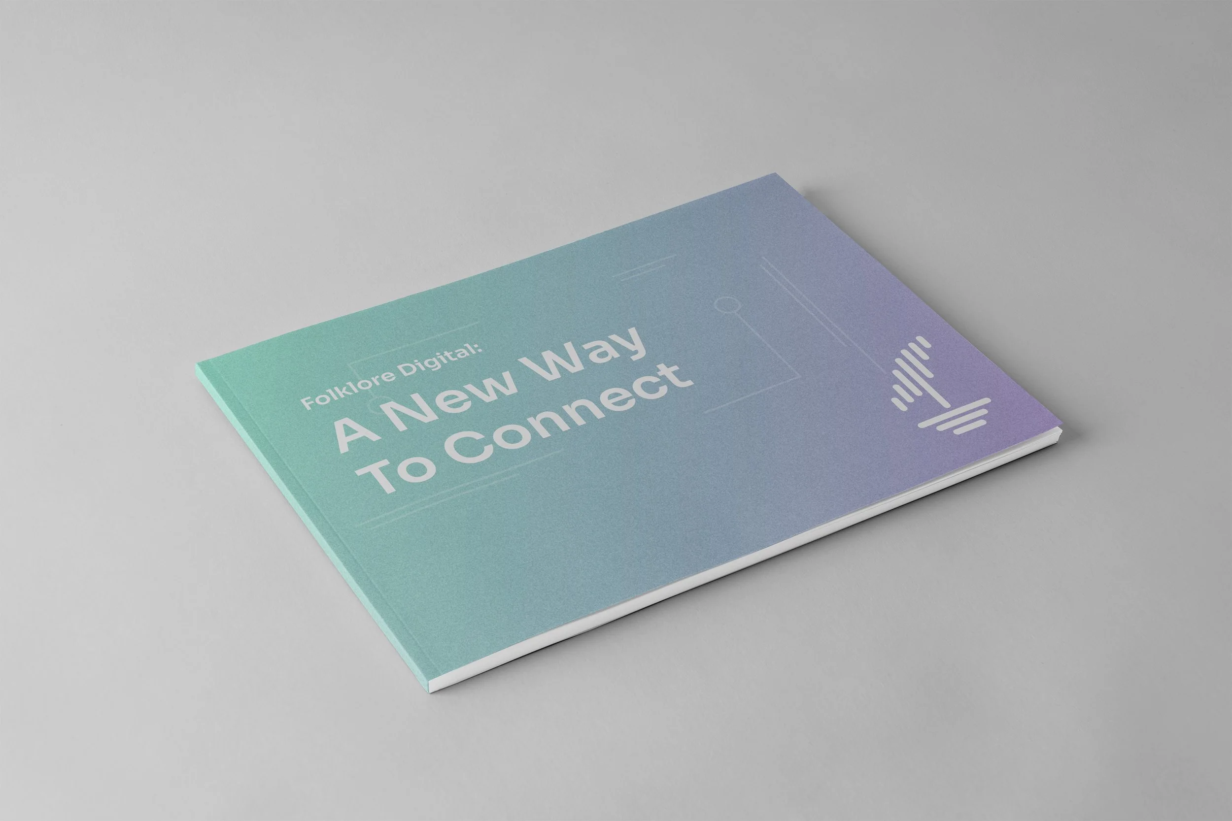
Folklore
Brand Identity • Strategy • Illustration System • Full Brand Guidelines
Overview
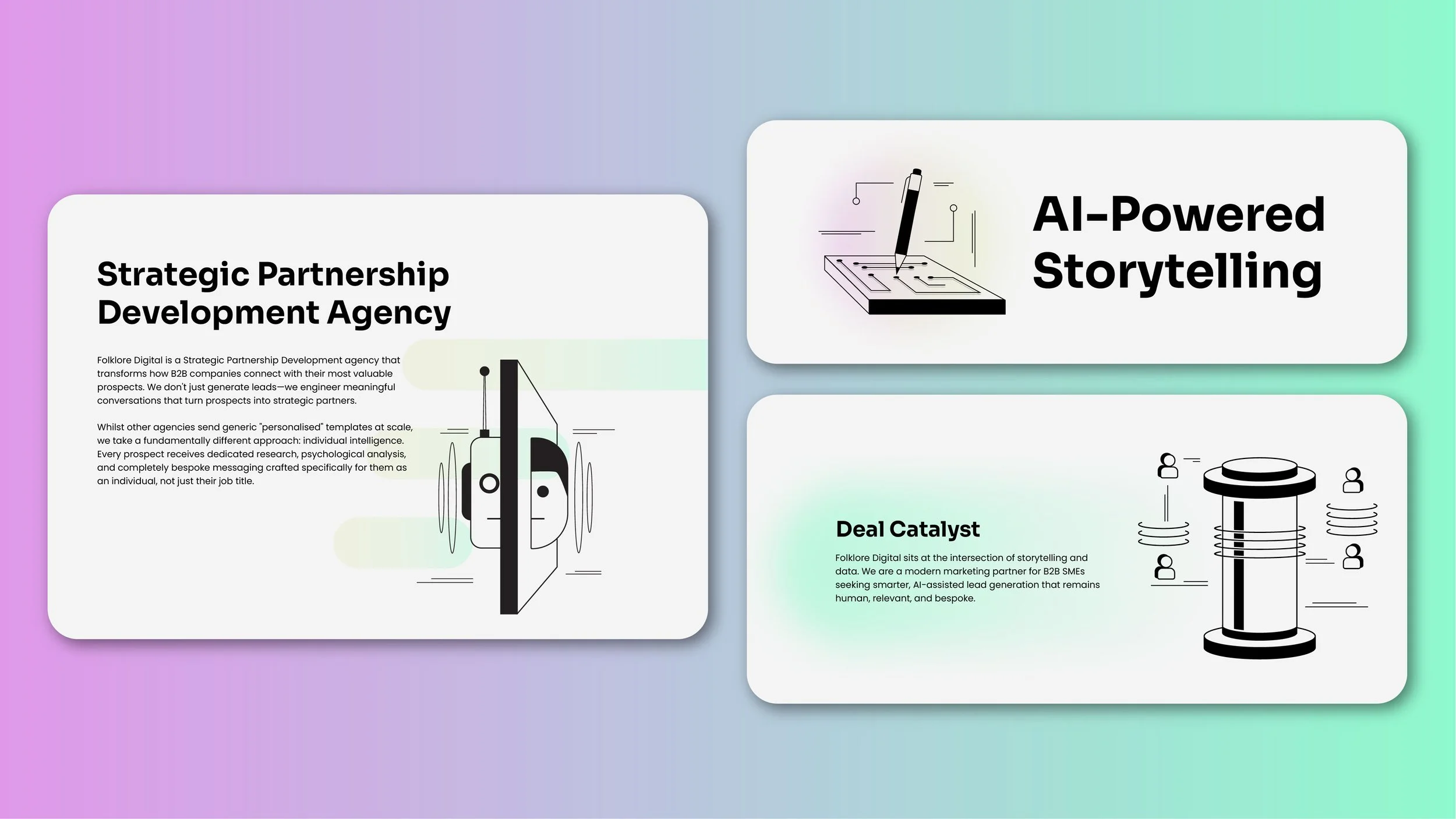
Folklore Digital is a strategic partnership development agency that transforms how B2B businesses connect with their most valuable prospects. With a unique blend of AI-driven research and human insight, Folklore doesn’t just generate leads, it engineers long-term relationships.
This project involved creating a complete brand identity system that reflected their hybrid, high-performance model: part intelligence platform, part deeply human storytelling engine.
The Challenge
Folklore needed a brand identity that:
Positioned them as premium and intelligent, not another outbound agency.
Visually balanced technology and empathy.
Felt modern, restrained, and timeless, yet full of personality.
Provided a usable, scalable design system across pitch decks, outreach tools, and digital presence.
Their team came with strong vision and values, but needed an identity to match their depth and differentiation.

Creative Direction
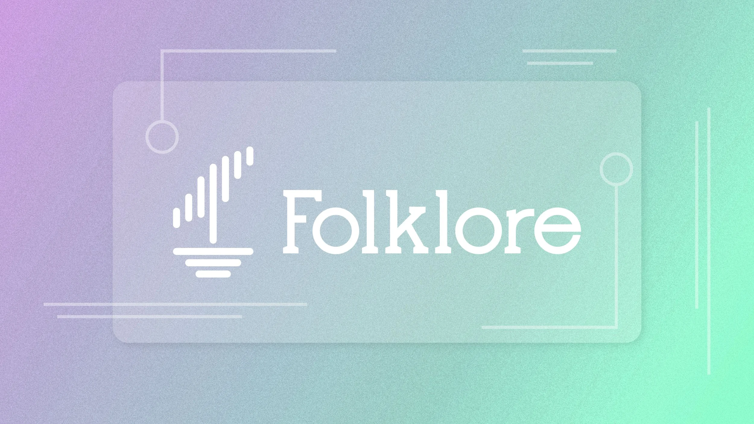
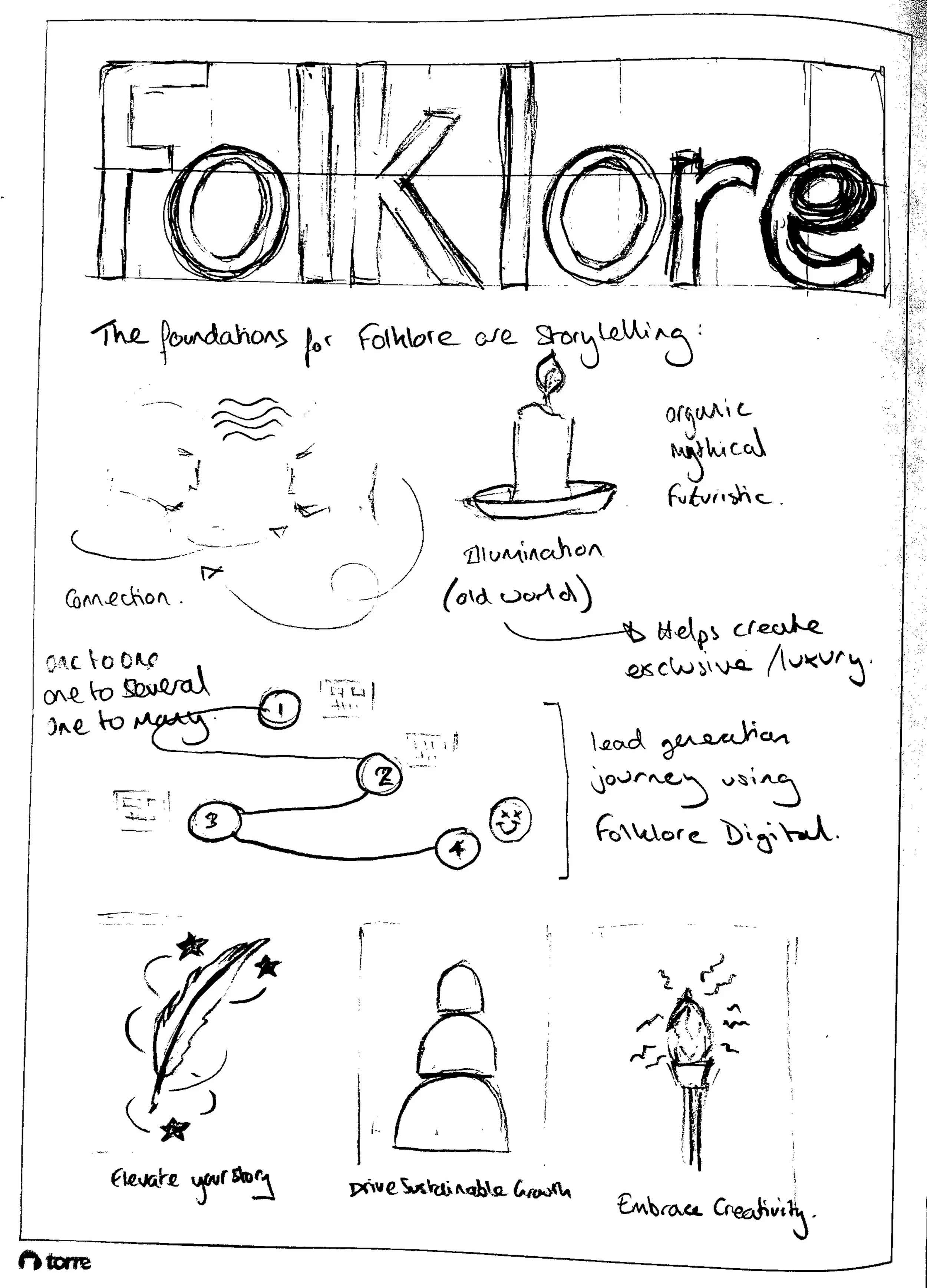
The visual identity of Folklore Digital is designed to reflect its unique position at the crossroads of human insight and AI precision. The creative direction combines tech-forward minimalism with artistic, almost surrealist elements to express the brand’s commitment to intelligent efficiency without losing the human touch. Gradients with subtle grain add warmth and texture, humanising the sleek digital aesthetic.
A customised, ancient-meets-modern wordmark anchors the identity, supported by bright harmonious colour gradients, sophisticated palette and geometric illustration style that communicates clarity, structure, and innovation. Abstract symbols and modular elements convey connection, storytelling, and growth—mirroring Folklore’s approach to crafting high-value partnerships through personalised, AI-enhanced outreach.
Client Testimonial
"We partnered with George (Drewett) on Folklore’s rebrand. From the outset he helped us clarify what makes our ABM, lead generation and partnership work different, then translated that into a flexible identity — logo suite, colour palette, typography, assets and guidelines — plus the collateral we needed day‑to‑day (including business cards, email signatures, document/slide templates). His process is structured but collaborative: he listens, asks sharp questions and isn’t afraid to push for the strongest outcome. Communication was excellent and he kept us moving to the agreed timeline. The new identity has made our proposals, outreach and partner materials feel more confident and consistent, and we’ve already had positive feedback from clients and prospects. I’d recommend George to any B2B team that wants a designer who brings strategic thinking as well as design craft.”
James Avery - Co-founder Folklore
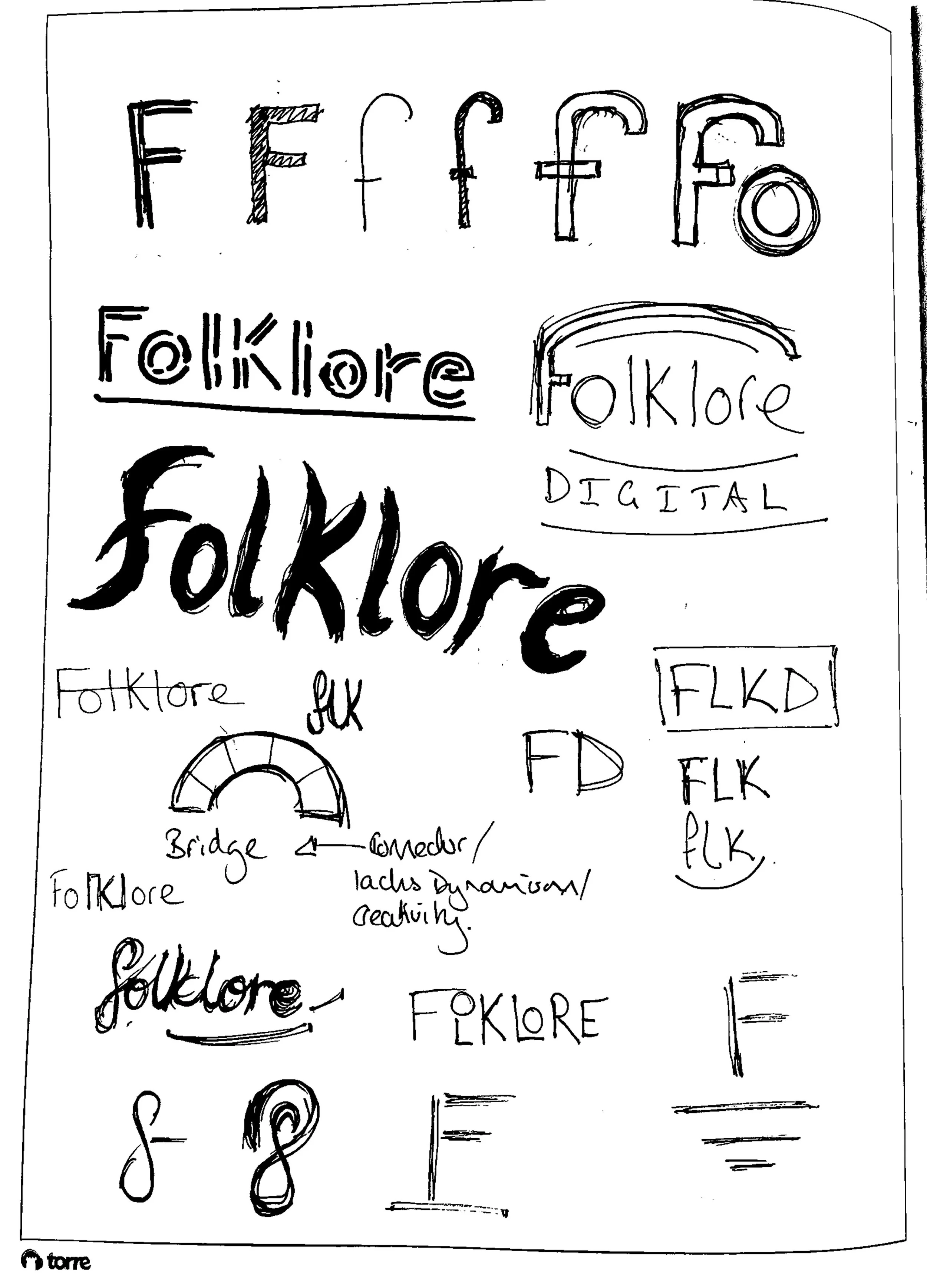
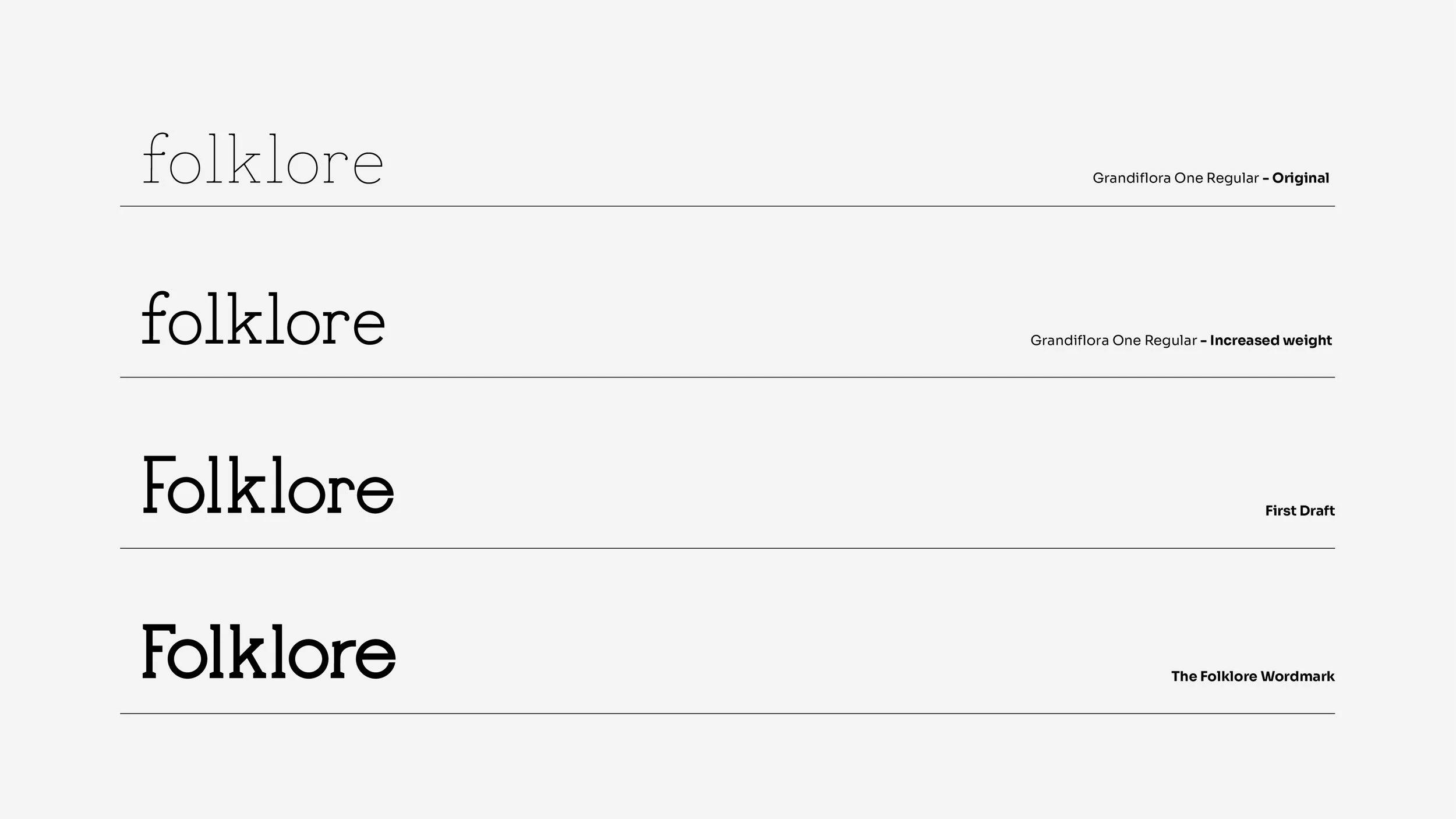
Wordmark
The Folklore Digital wordmark was designed to balance the tension between technology, humanity, and sophistication. Rooted in Grandiflora One Regular, the typeface was chosen for its confident yet subtly enigmatic tone, offering a distinctive personality that stands apart from purely utilitarian sans-serifs or overly ornate type.
To strengthen its presence, the designer increased the weight through custom strokes and then evolved the base characters into a bespoke mark. Angular and geometric features were introduced to convey authority and precision, while carefully placed diagonals and softened serifs, inspired by ancient scrolls and classical letterforms, ensure the identity retains warmth and movement.
The final result is a refined typographic signature that feels both crafted and contemporary—a visual metaphor for Folklore’s promise: intelligent systems, delivered with a human touch.
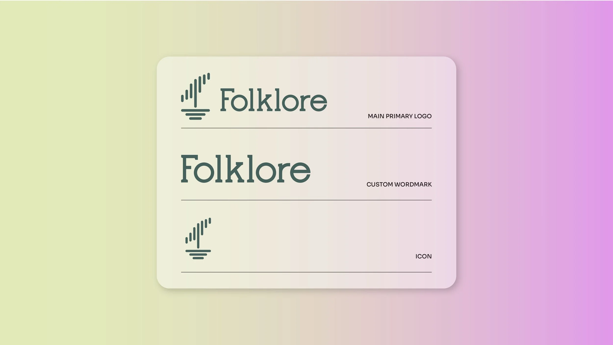
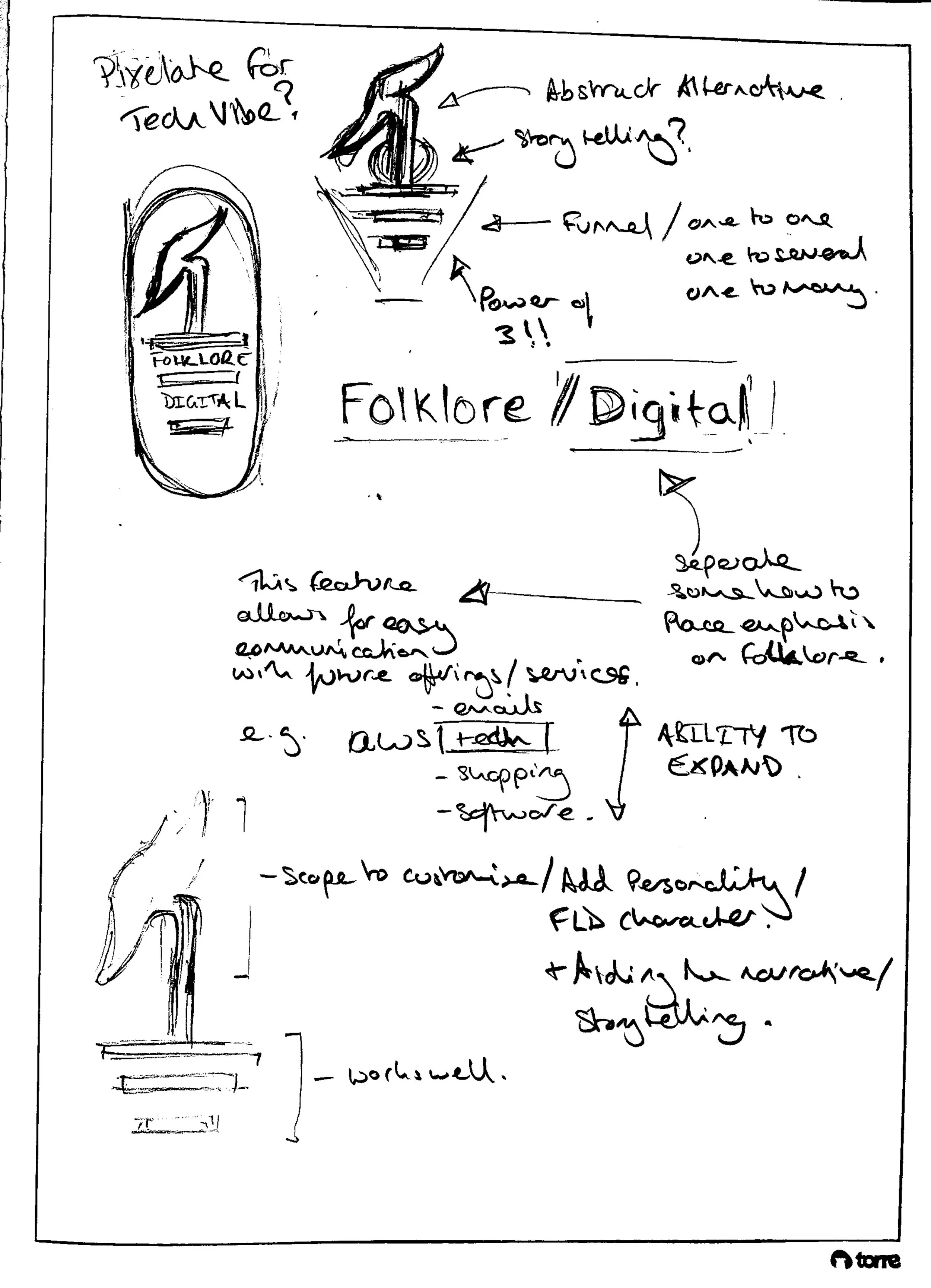
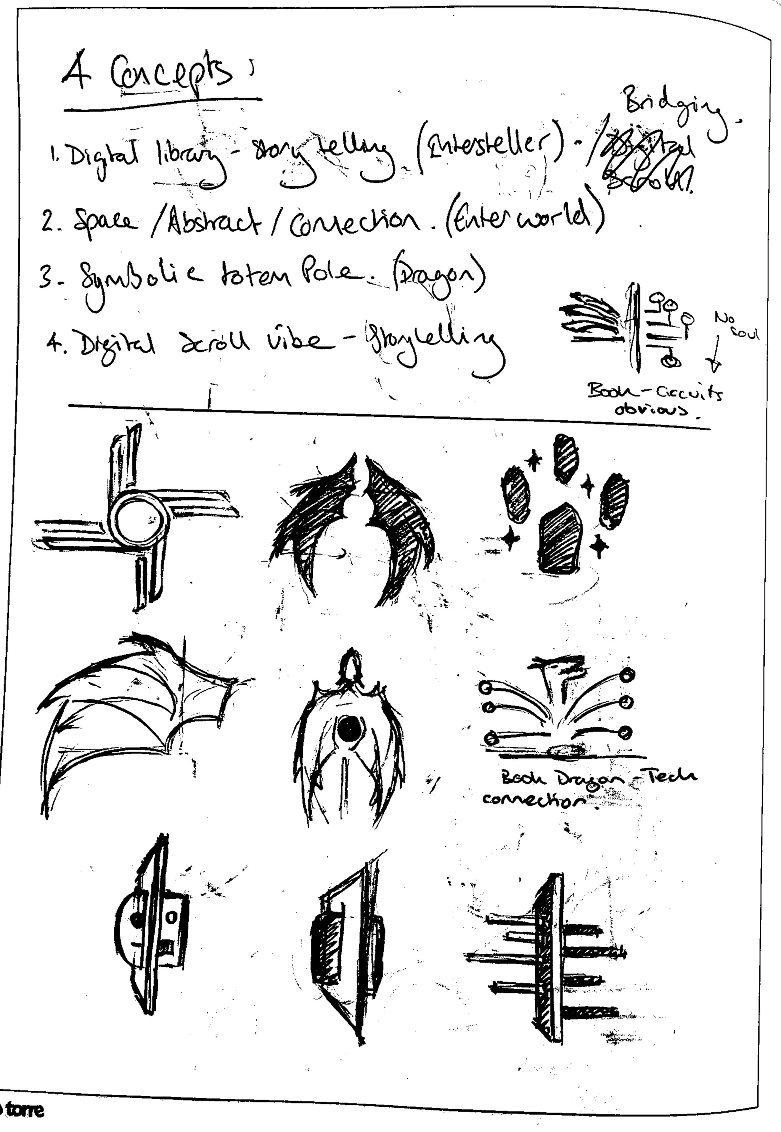
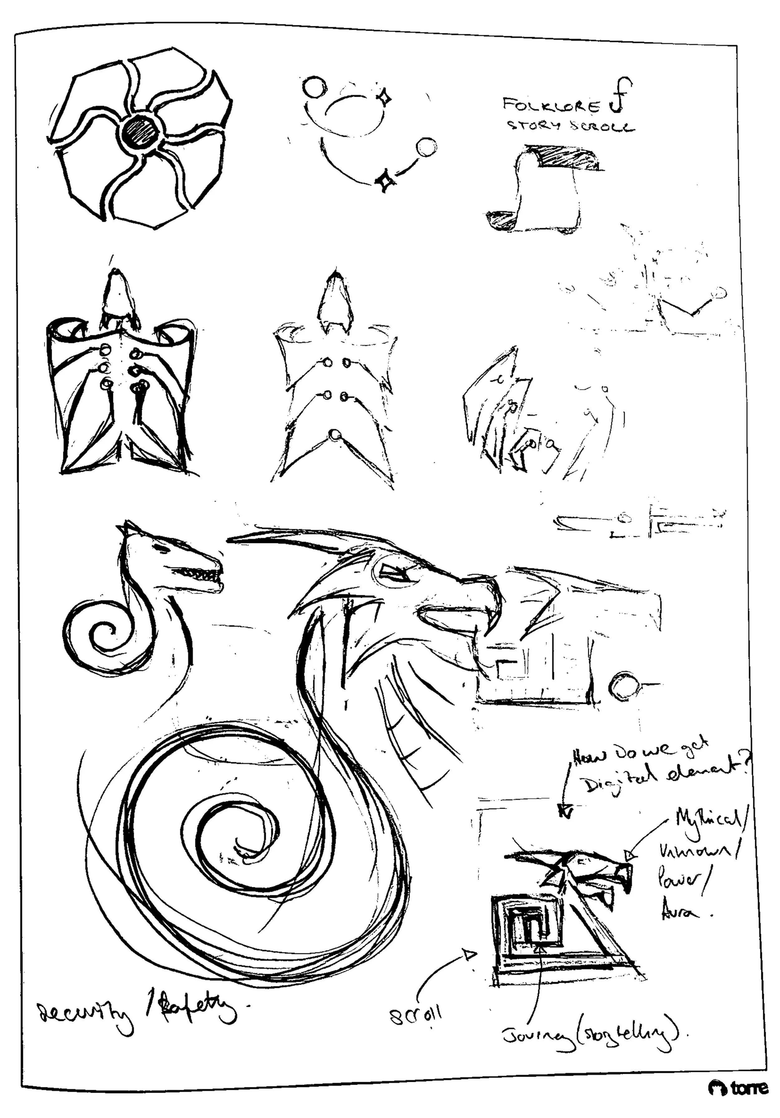
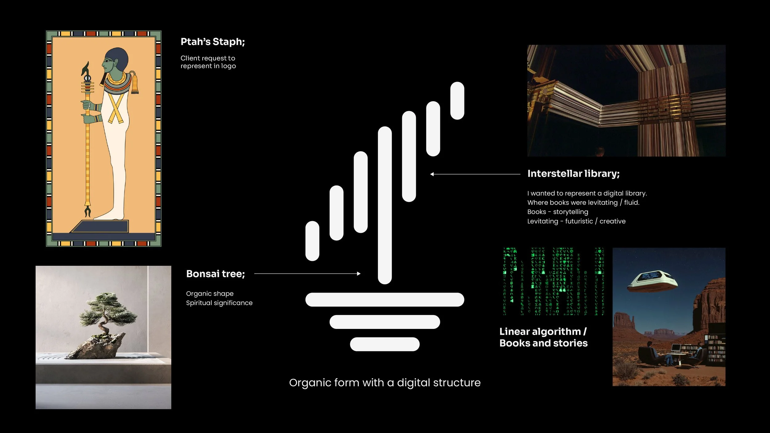
Logo Concept
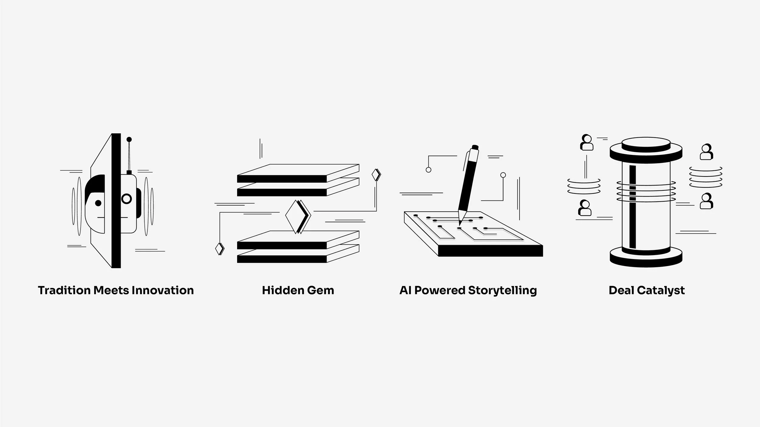
The icon was inspired by:
Ptah’s Staff (symbol of creation & craftsmanship)
A Bonsai Tree (organic growth through careful shaping)
A Digital Library (structured knowledge, algorithmic thinking)
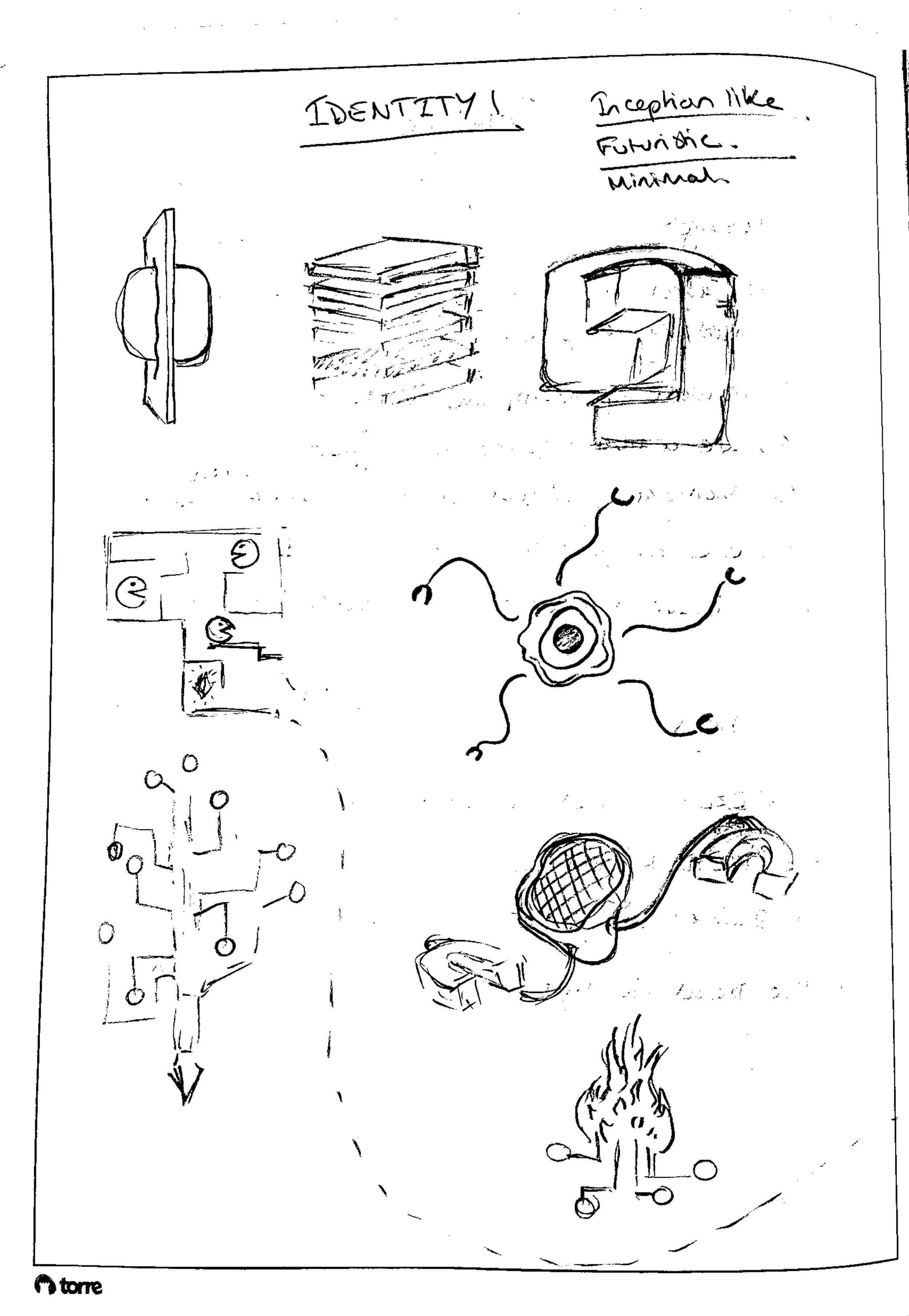
These elements were abstracted into a form that evokes levitating books, fluid logic, and digital soundwaves. The result is a symbol that feels both grounded and futuristic.
Visual Language
Grain & Texture: Used sparingly to evoke tactility and grounded warmth, especially in light mode.
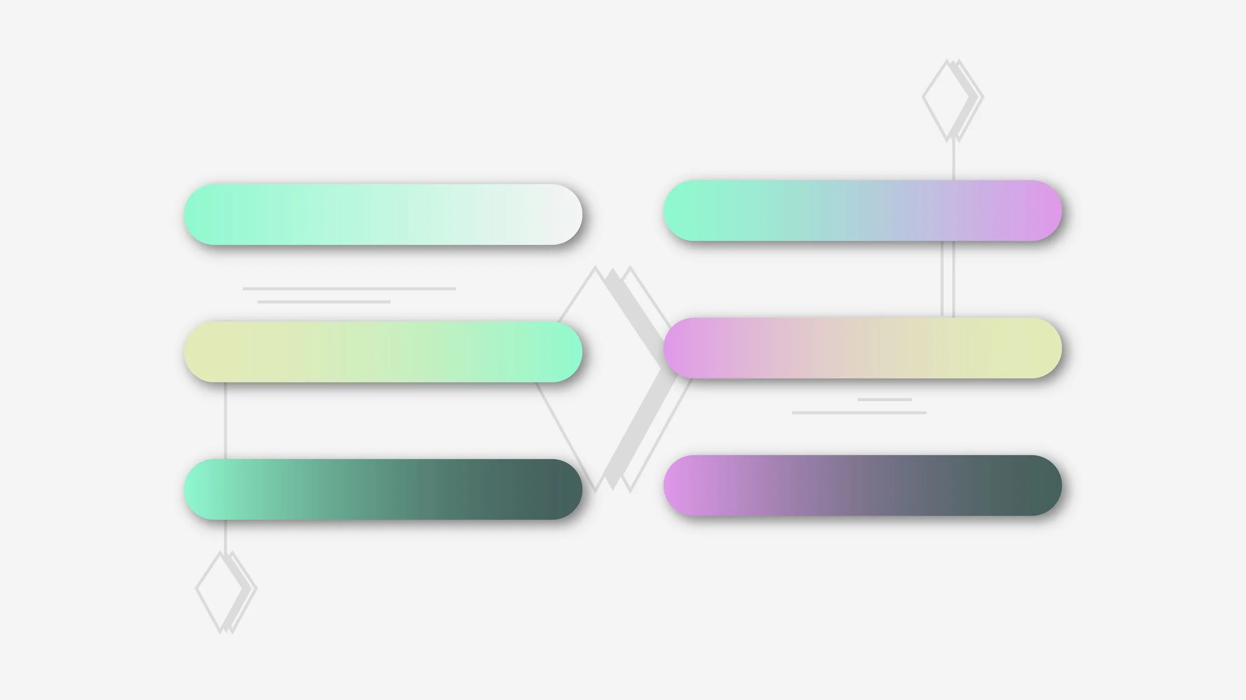
Colour System: Soft mint gradients offset with cool charcoal greys and off-white, a nod to clarity, innovation, and calm confidence.
Typography: Poppins and Sora provide structure and readability, balancing modernity with humanity.
Illustration Style: Abstract, modular, minimal, visual metaphors for duality (human/machine, past/future, signal/noise).

Brand Guidelines
Delivered a full identity system including:
Mission, vision, tone of voice, and brand positioning
Logo suite + usage rules
Grid, spacing, colour, and typography guidance
Digital & print application examples
A set of 10 Cardinal Rules for maintaining consistency across all brand outputs
Real-world mockups showing application on devices, posters, and pitch decks
Outcome
The final brand is elegant, functional, and deeply strategic, a system that visually communicates what Folklore does, not just what it looks like. It helped reposition the agency as a category-defining partner, not just a vendor.